Kukui'ula Outrigger
Reimagining Kukui’ula Outrigger with strong typography and bold visuals.
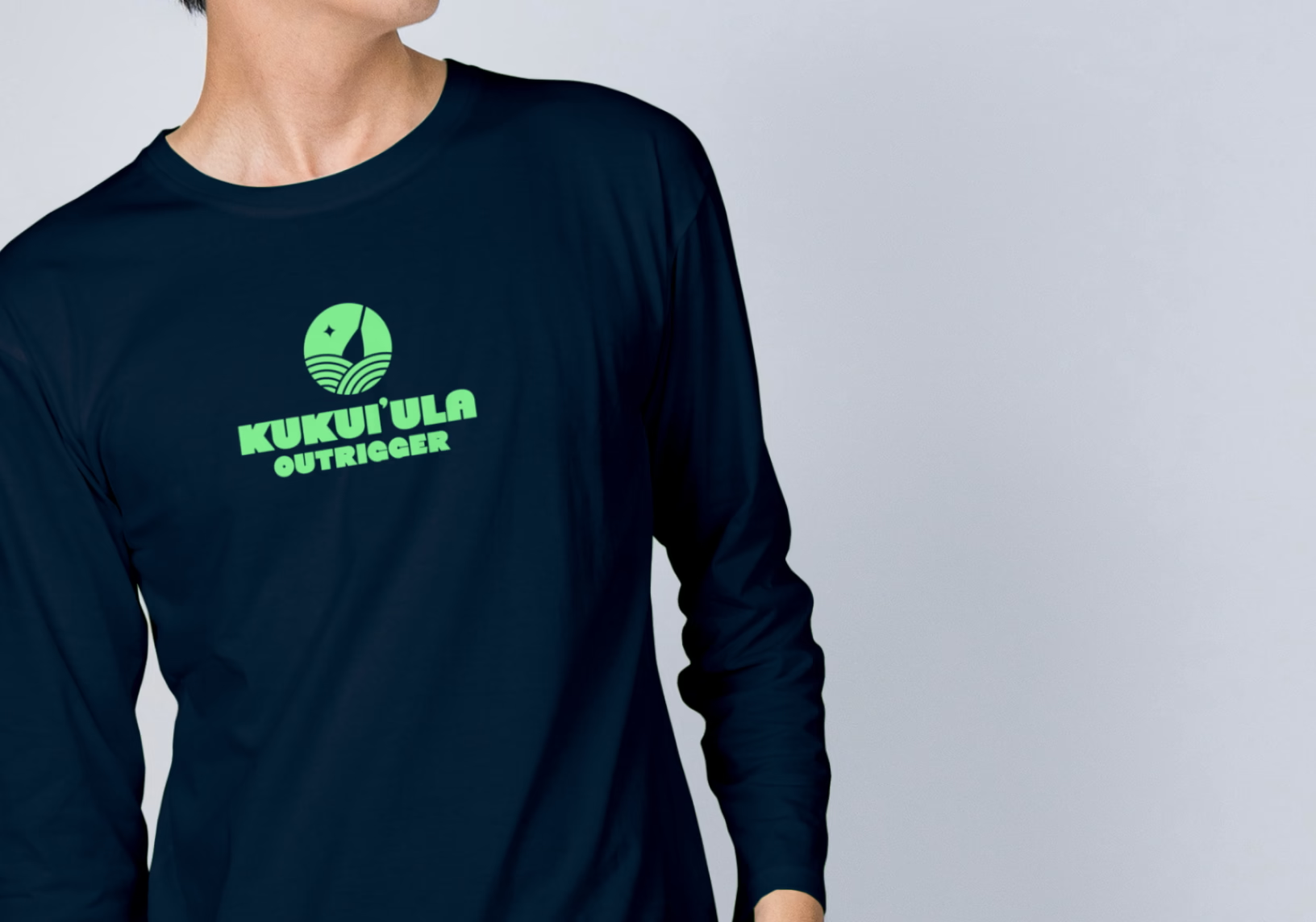
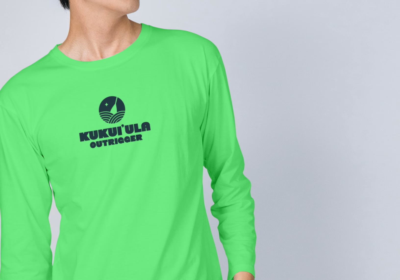
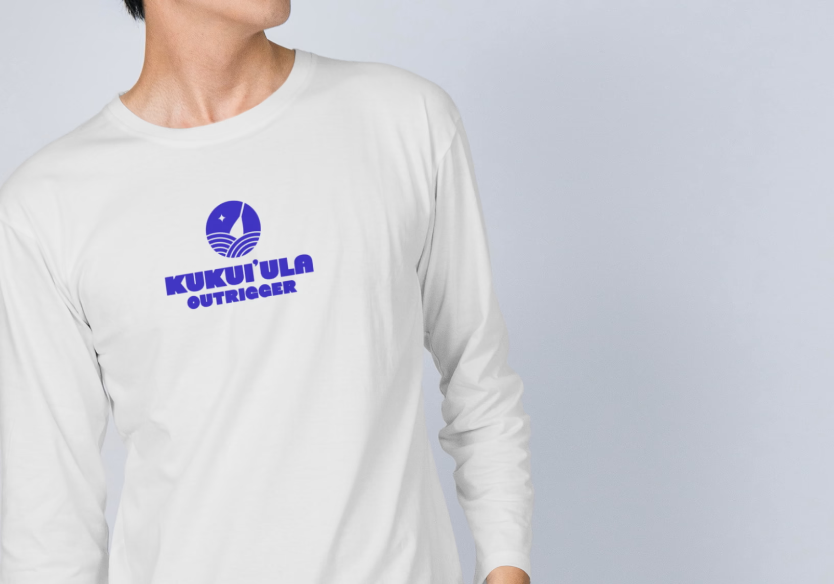
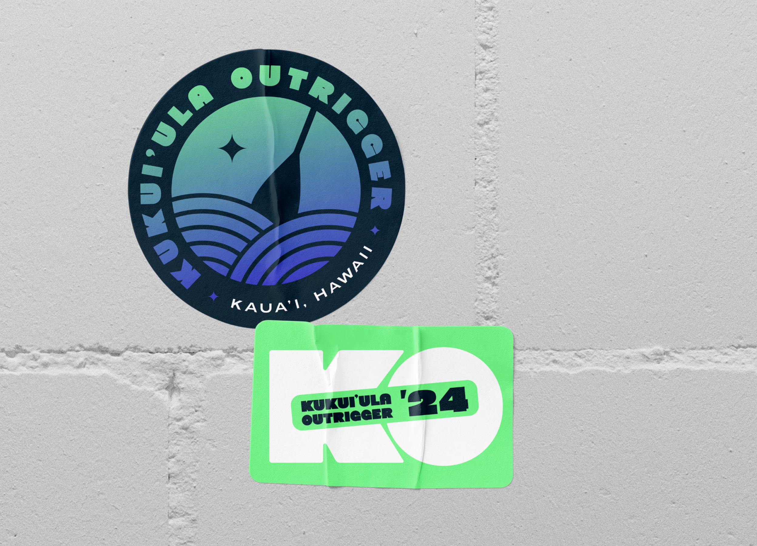
In the process of creating this rebranding it was important to consider all the applications and touch points where it would be encountered. With this in mind I developed variants of the logo to work successfully as a single color, a badge, and vertical as well as horizontal lockups. This allows for printing on something like a tee shirt with maximum legibility, and the flexibility to use the badge version in a social media post.
Services
Brand identity, collateral design, social campaigns. Year 2024
Information
The waves in the logo in combination with the partially submerged paddle instantly identifies this as a canoe club, while the star is a nod to the heritage of the canoe and its role in the legacy of Hawaii.
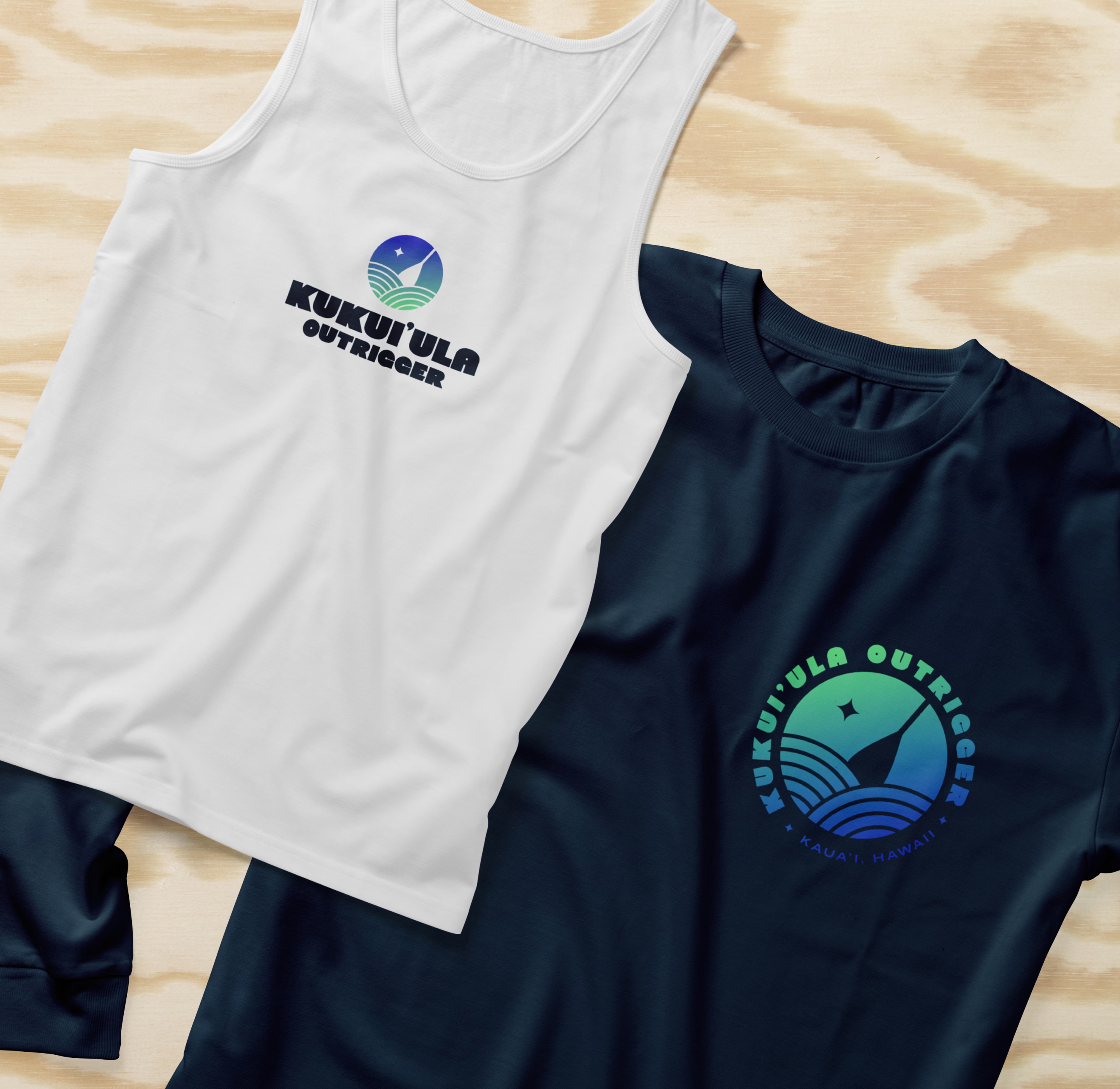
Club jerseys
Social campaigns
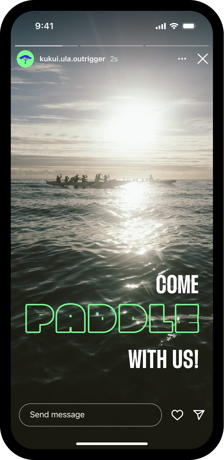
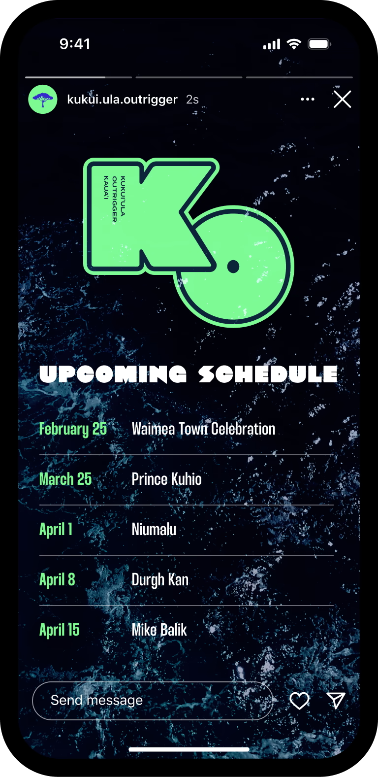
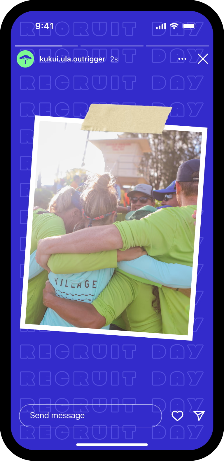
Brand extensions
Reflections
The final identity system gives Kukui’ula Outrigger a cohesive, professional presence that reflects the pride and tradition of the club while being practical enough for real-world use across apparel, social media, events, and community outreach.
