Angela Listerud
Brand strategy and identity for a digestive health specialist
Angela Listerud is a registered dietitian nutritionist focused on digestive disorders. Her work helps adults move past years of trial and error with food, supplements, and elimination protocols, and toward lasting digestive stability through a structured, personalized approach.
Services
Brand identity, collateral.
Year 2026.
Information
Angela came to this project wanting a brand that would feel as serious as the science behind her practice, but warm enough to meet people who are tired of being told their symptoms are nothing.
The digestive health category is noisy. It is full of quick-fix protocols, supplement stacks, and aggressive elimination plans. Angela’s approach is the opposite. She works case by case, builds programs around real biology, and treats the gut as part of the whole body.
As the outcome of a naming exercise we determined early on that the identity would be built on Angela’s name as the anchor. Based on her credentials and thought leadership this held the most brand equity.

Voice
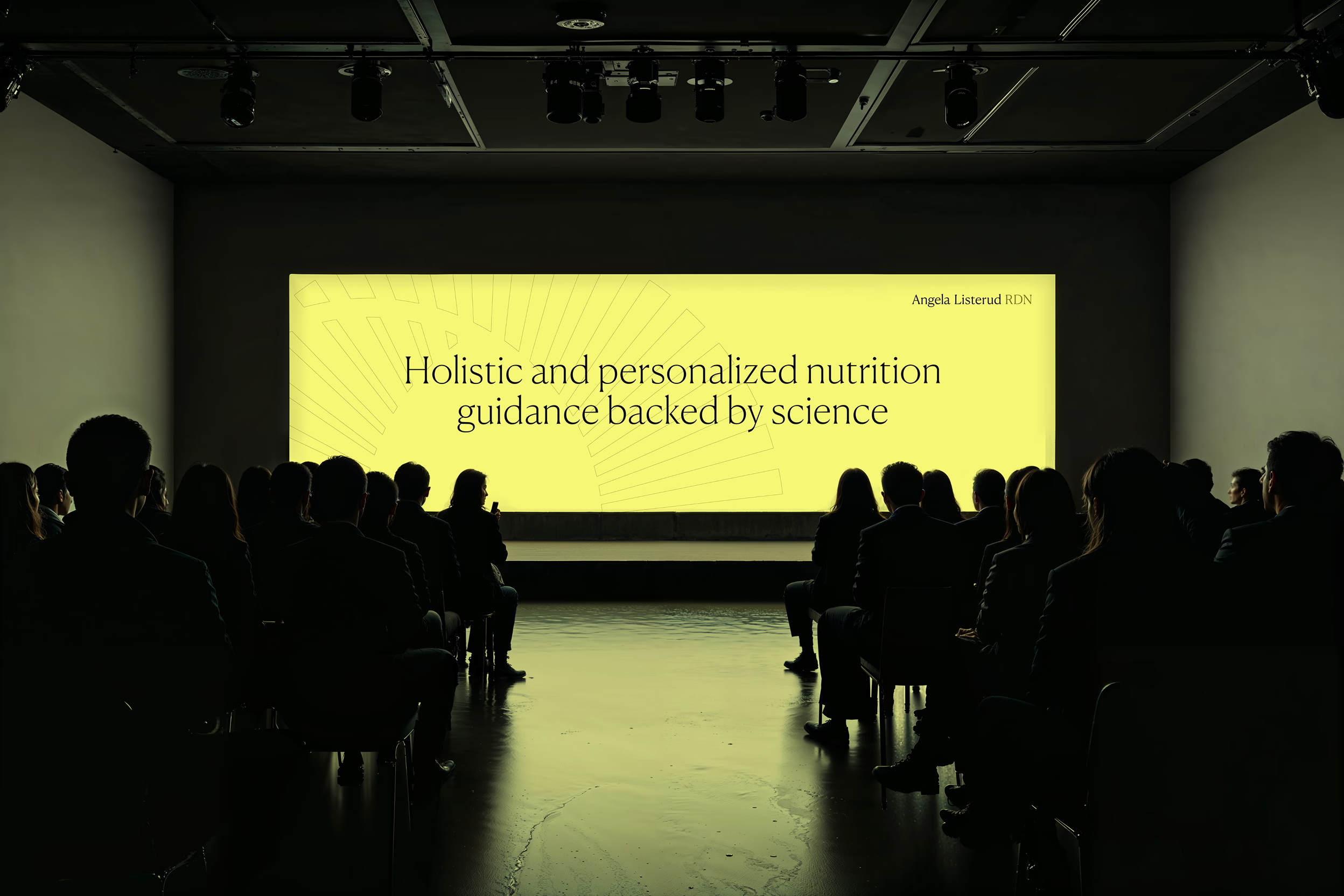
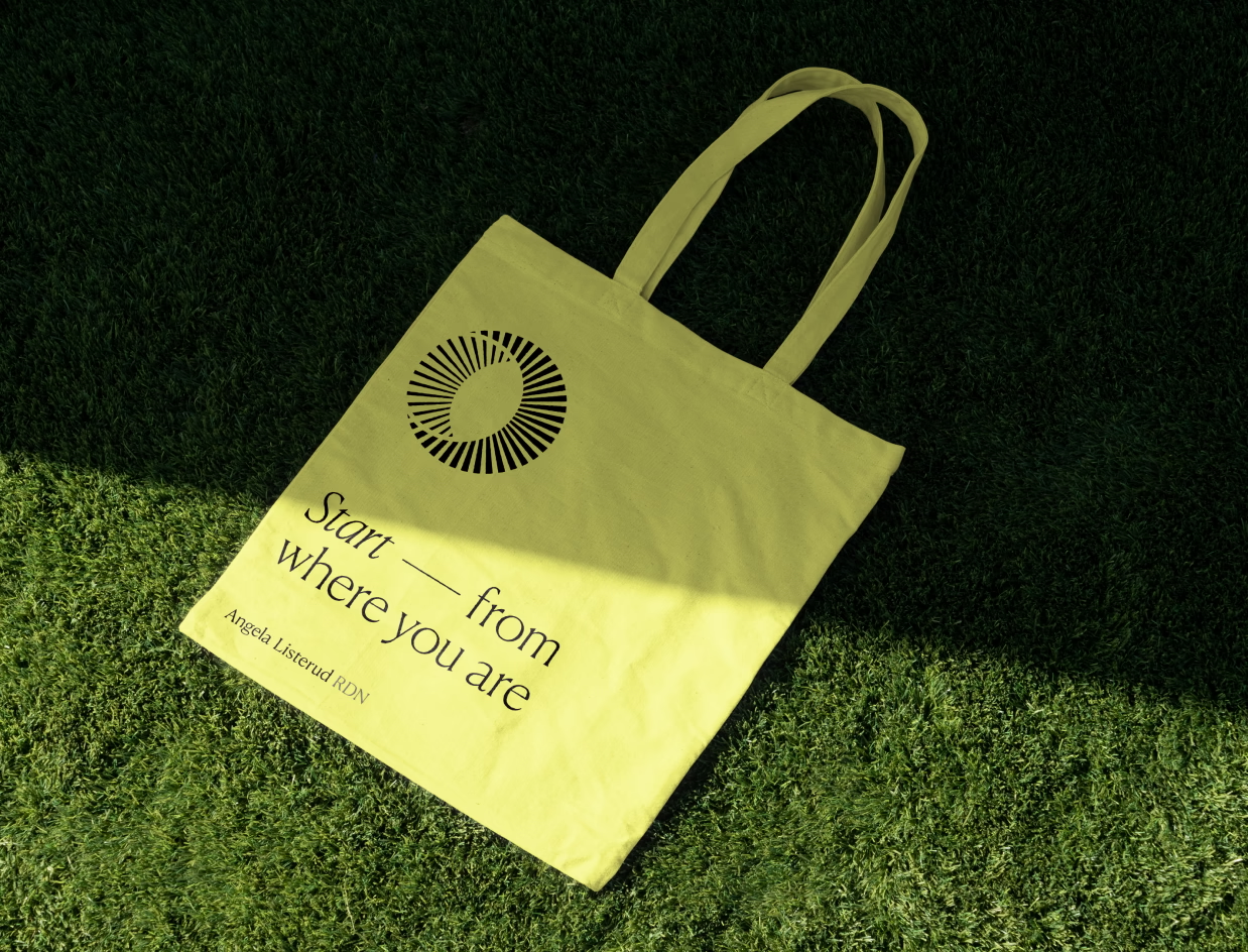
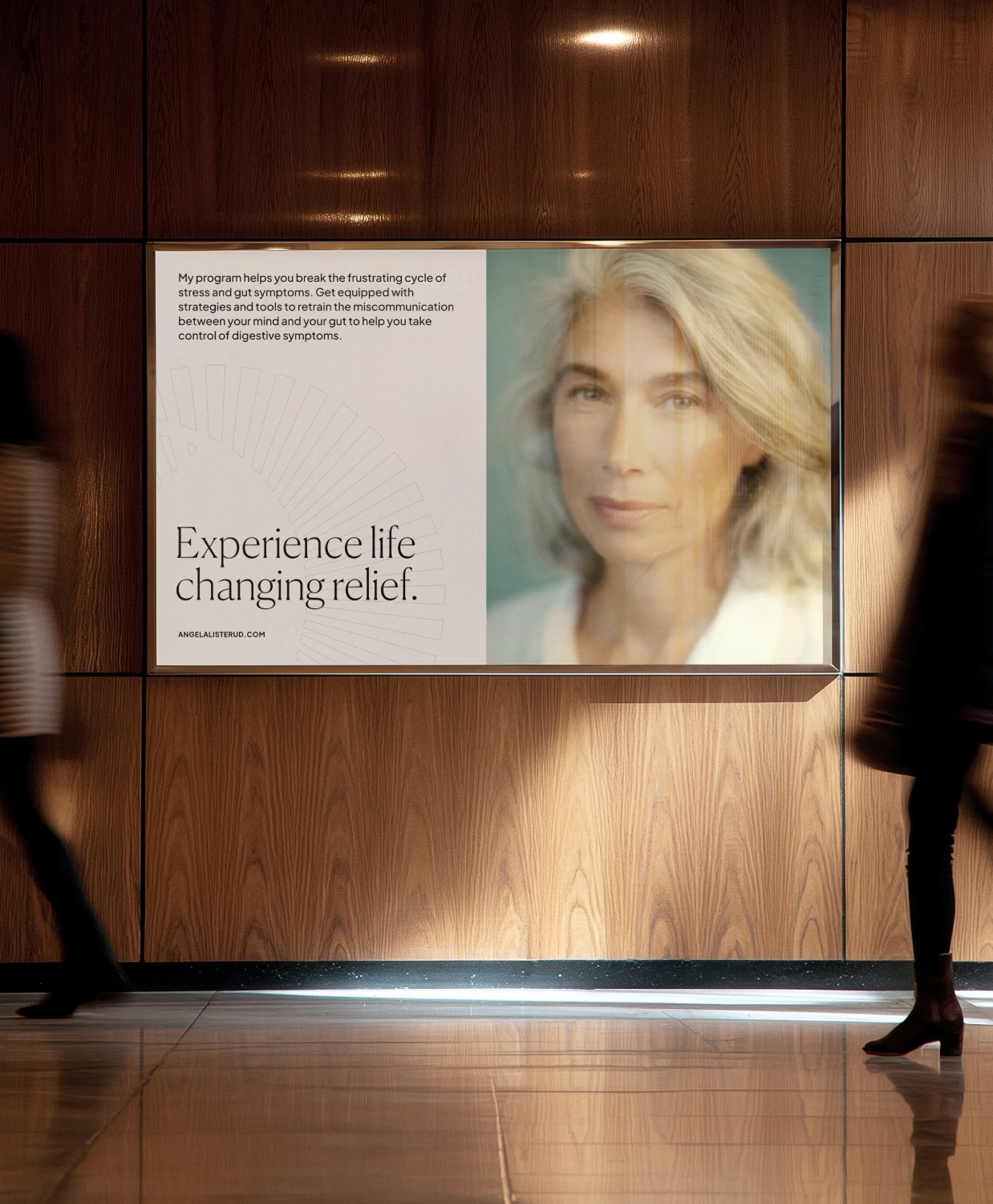
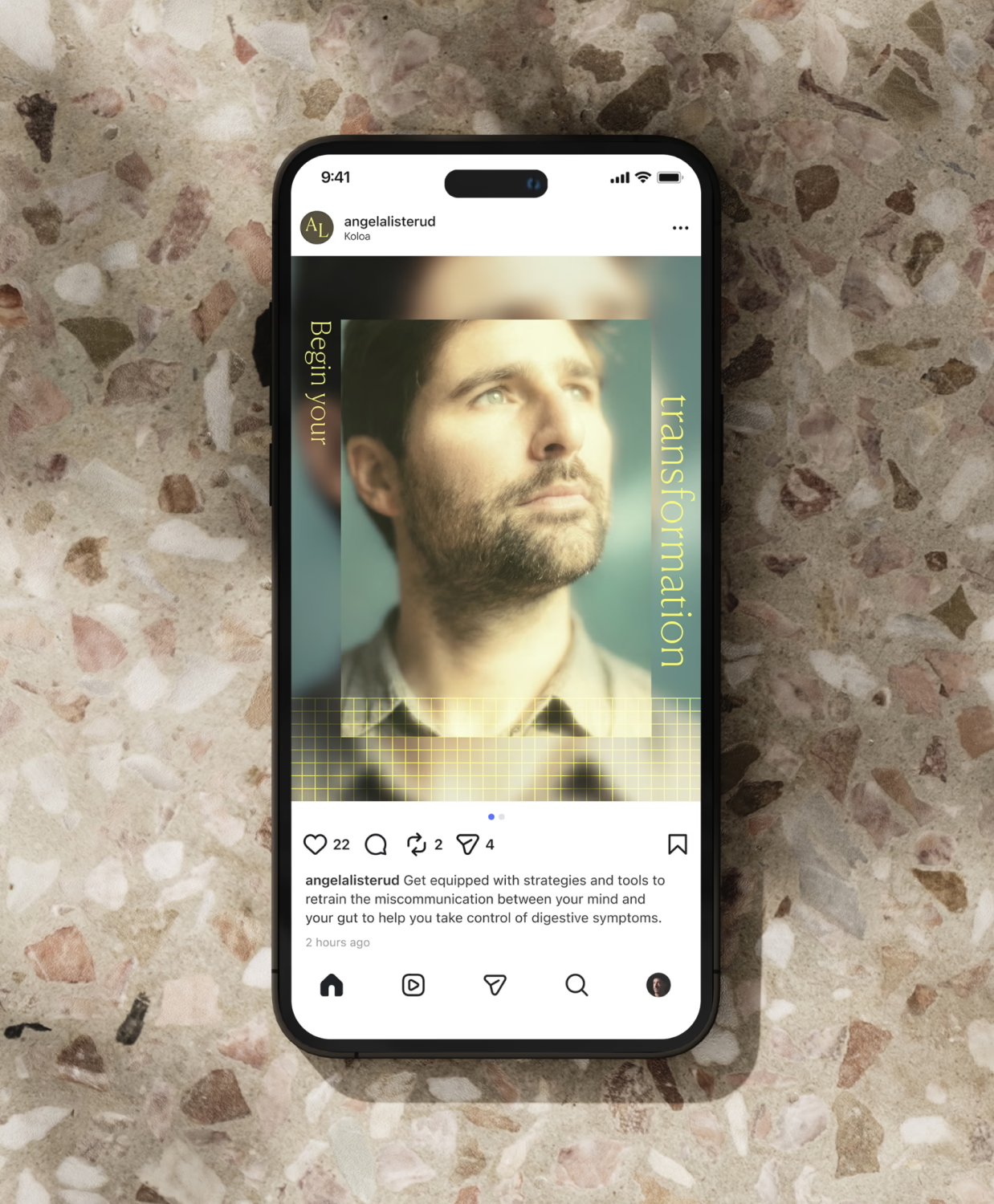
Angela’s voice carries authority without lecturing. The phrase we used as a guidepost during writing was “calm authority giving intelligent guidance with compassion.” That meant cutting anything that sounded like another diet pitch and leaning on language that felt steady, considered, and human. Lines like “start from where you are,” “move beyond trial and error,” and “science, not opinions” set the tone across the system.


Brand Identity
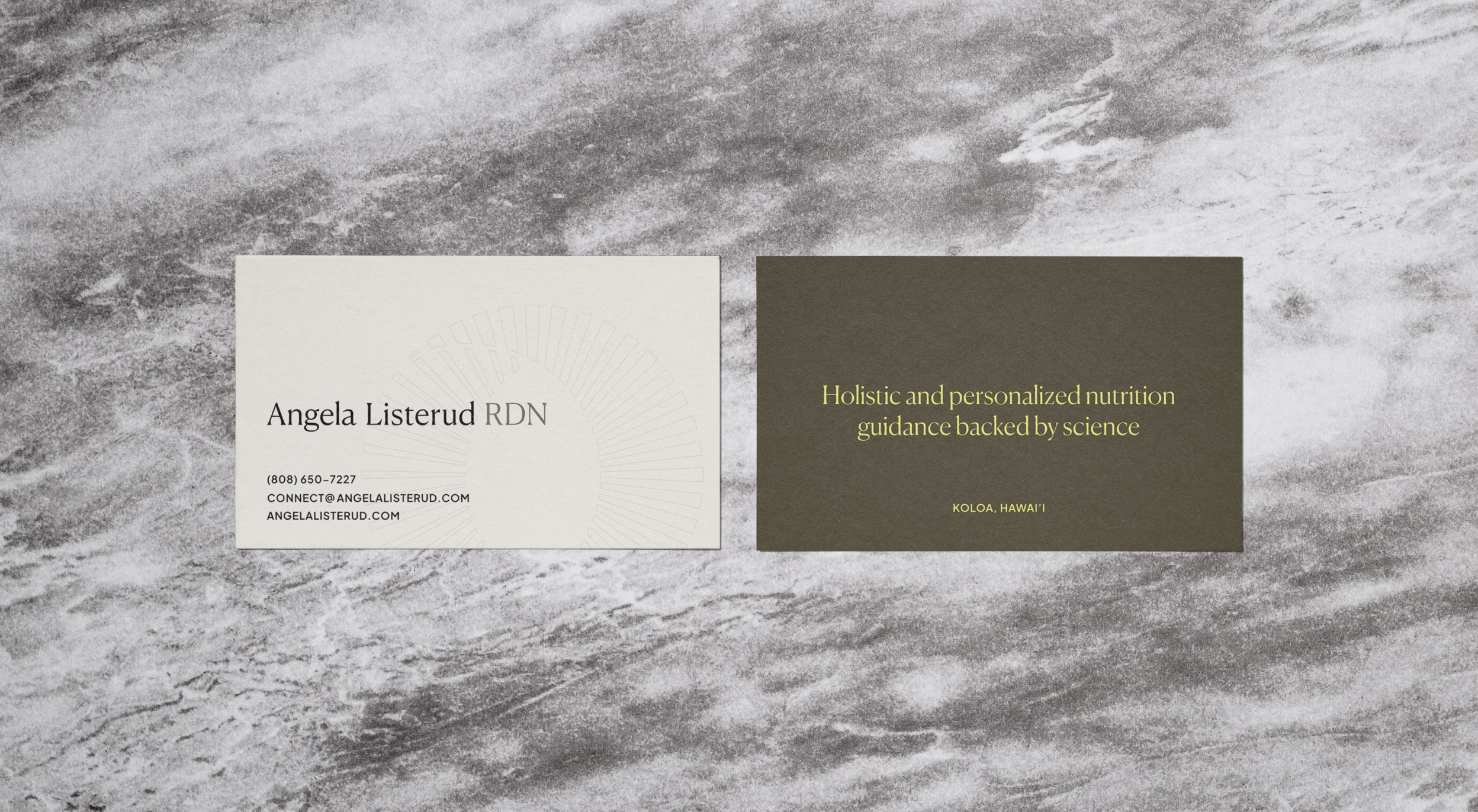
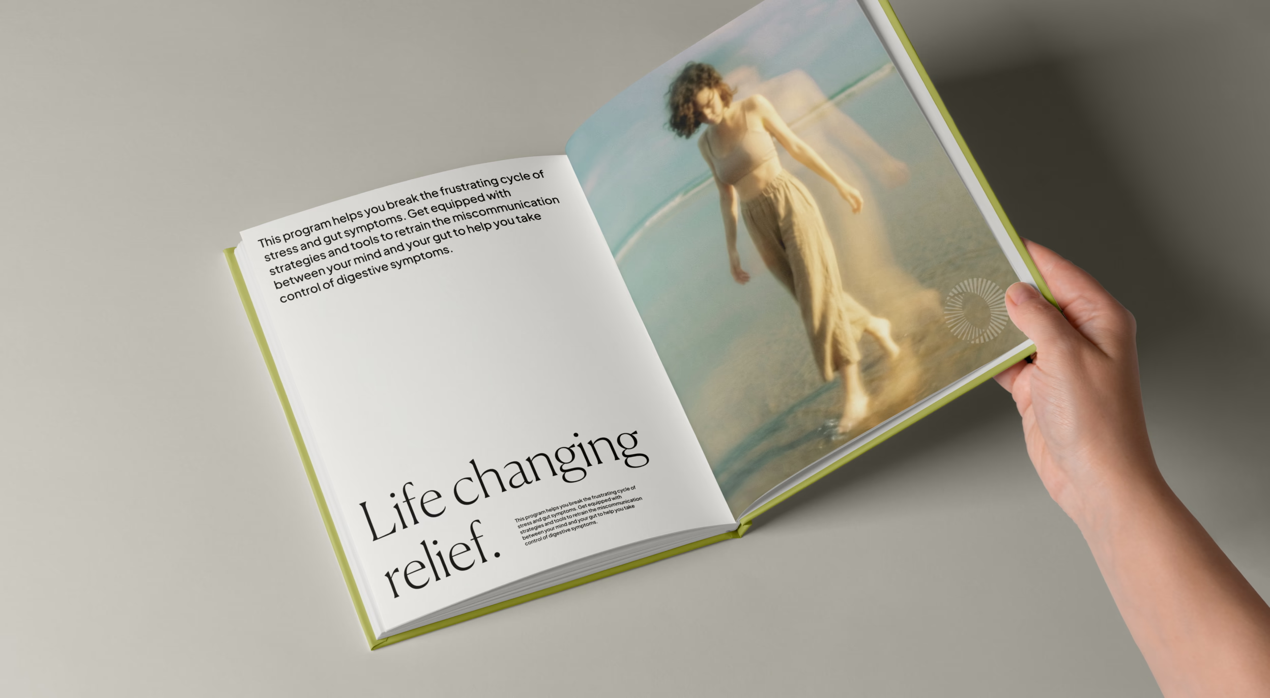
The visual system needed to hold two things at once: clinical credibility and warmth. The logomark is intentionally abstract, built around ideas of evidence, transition, and root systems. The logomark pairs with Canela, a display face with forms that occupy an ambiguous space between sans and serif, soft and sharp—a modern design with roots in the classical. The result reads as professional and considered without feeling sterile.
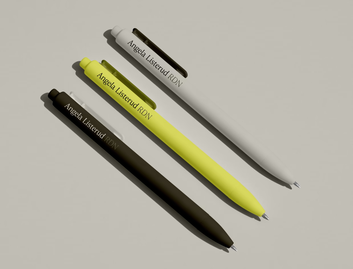
The palette pulls from nature. Earthy tones do most of the work. Brighter accents carry the message of growth and transformation when the moment calls for it. Textures and patterns extend the system. Limewash, granite, and paper add tactility. Dot grids and graph patterns nod to the scientific framework underneath the practice.
The system extends across print, web, mobile, and out-of-home applications. The flexibility was deliberate with variants accounting for all applications and form factors.
Reflections
What Angela has now is a brand that signals what she actually delivers: a structured, evidence-based, whole-body approach that respects the intelligence of the people she works with. The system gives her room to grow while keeping the message consistent.